we dropped by the GK design open house
in paramount.
( they established an office
in los angeles area in 1966 )
本日はGKデザインのオフィスのオープンハウスに行って参りました。
and they started to design music instruments
for yamaha. this is YA-1,
the frist yamaha motorcycle that
they(GK)designed in 1955.
こちらがGKデザインが1955年に手がけたヤマハの最初のバイク
YA-1.
in 1961, they designed this well known
kikkoman soy sause bottle and became very famous.
one of the pioneers of industrial design in japan.
この誰もが知っているお醤油瓶のデザインで一世を風靡し、
インダストリアル・デザインというものを日本に定着させた先駆者であります。
they have been designing motorcycles, snowmobiles,
quads and etc. for yamaha for over 50 years!
not just for yamaha they design so many different things for so many different companies.
50年以上に渡ってヤマハのバイクデザインを手がけていて、
ヤマハだけでなく、様々なもののデザインを様々な企業の為に
デザインし続けている、と今日知ったばかりの
にわか知識を披露しちゃってすみません。
例えば・・・
にわか知識を披露しちゃってすみません。
例えば・・・
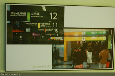
they design trains, too.
電車!
these signage at the train station in tokyo
are very familiar but i didn't know they were
designed by GK.
これ、とても馴染み深いJRの路線サイン!
これもGKデザインによるものだったなんて、知らなかったなあ・・・
shinya has always liked GK design
since he was a kid. you can easily imagine
how excited he was tonight.
how excited he was tonight.
he enjoyed seeing those motorcycle sketches
through out the office, although he never draws
sketches himself for his motorcycle designs...hehe
had a great time :)
小さい頃からGKデザインが好きだったという木村氏。
オフィス中に貼られたバイクのデザインスケッチを堪能。
自分がスケッチを一切描かないため、余計に感動。


5 comments:
That YA-1 could easily be the base for a new retro
Yam liteweight..if it had a 4-stroke.
Classic,classic design. just like that kikkoman bottle.
I bought some sake last week that came in a bottle
just like it.
david: yes, they should make a 4-stroke! YA-1 looks really really cool, very classic. the sake bottle might be GK design's...cheers!
That sake bottle is sure as heck a copy of the GK bottle. And re the YA-1 it sure seems that mc design is movin' backwards..Are there any smaller bikes today
that are as cool as it was? I don't think so. And I don't think you do either.. It's kinda like VW Karmann Ghia
Vs. PT Cruisers. "Retro' can't compare with the real deal.
david: totally agree. the "retro" or "vintage look" is a horse of a different color. i mean they are not even a horse, a different creature in a different color. what's the point to make a new thing look like an old?
"what's the point to make a new thing look like an old?"
When the old school design had more class, and more restraint. There's a Japanese word for it that I can't
remember right now. No word in English for it, but
"austere restrainst and balance" kinda covers the concept.
Post a Comment